Day 1
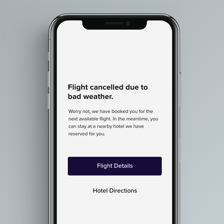
Scenario: A traveller is in an airport waiting for the last leg of a flight home when their flight gets abruptly cancelled due to bad weather.
Challenge: Write a message from the airline app notifying them of the cancellation and what they need to do next.
Character limits:
40 (Headline)
100 (Body)
25 (Buttons)
Day 2
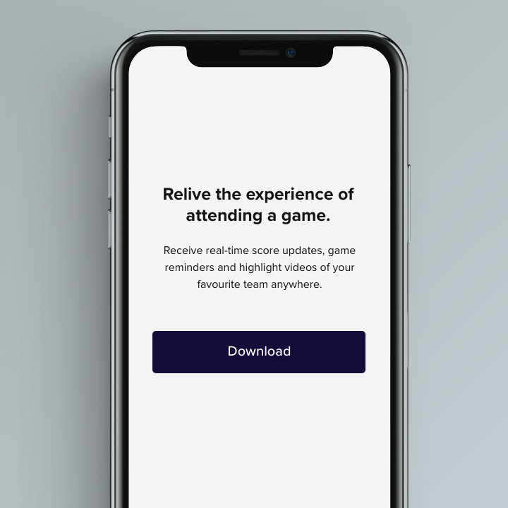
Scenario: A user is a working parent, and a big sports fan, in the midst of their favourite sports season who can no longer attend games.
Challenge: Write a promotional screen for an app that lets a user choose teams, sends game reminders, real-time score updates and highlight videos.
Character limits:
40 (Headline)
175 (Body)
25 (Buttons)
Day 3
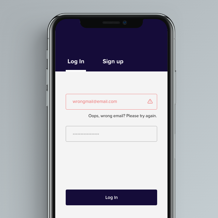
Scenario: The user entered the wrong email address to sign in to their account.
Challenge: Tell the user to enter the right email.
Character limits:
40 (Headline)
Day 4
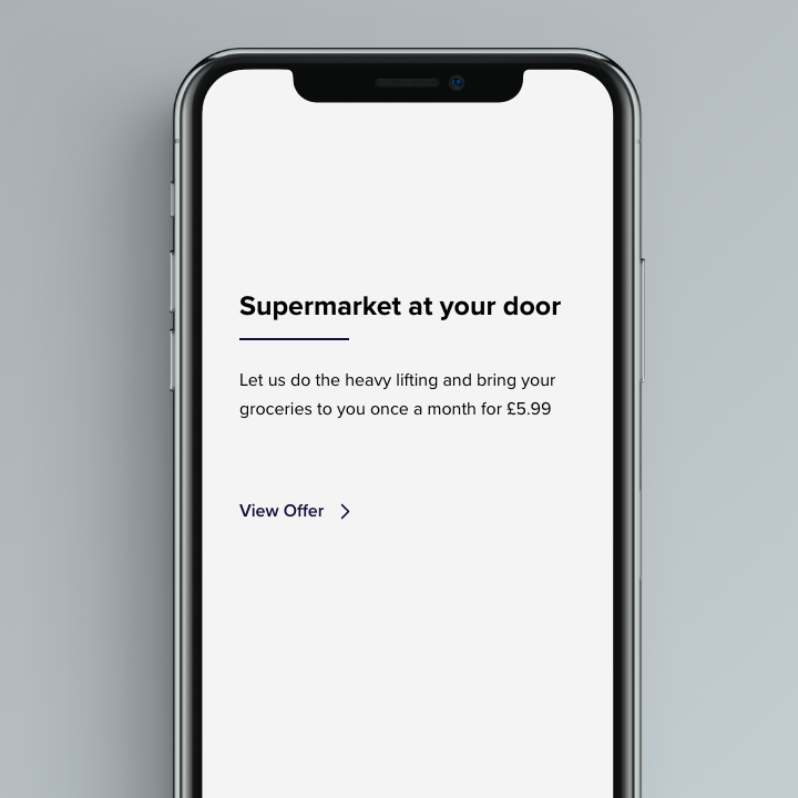
Scenario: A user is in their favourite supermarket. They open the supermarket's app on their phone to see what's on sale and are greeted by a promotion.
Challenge: Write a promotional home screen for a subscription service that delivers groceries to the user once-a-month for a flat fee.
Character limits:
45 (Headline)
175 (Body)
25 (Buttons)
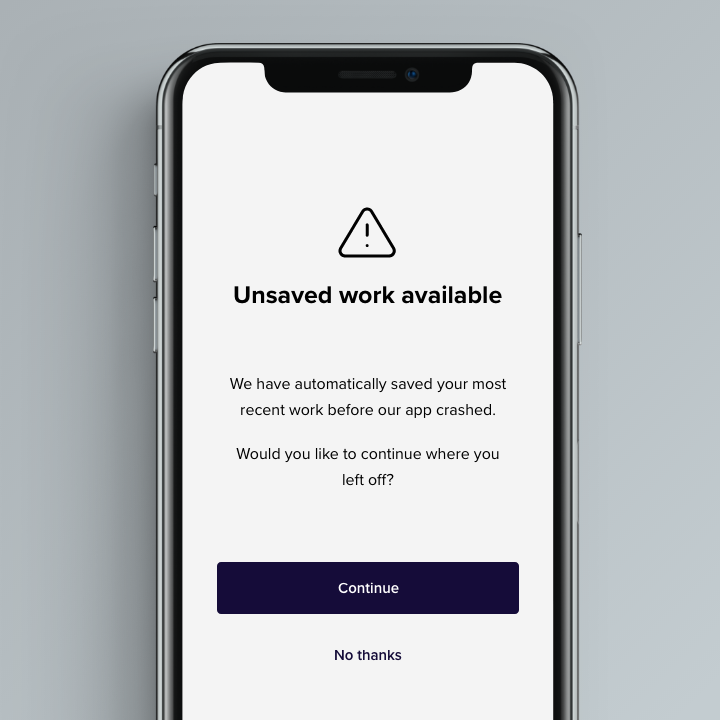
Day 5
Scenario: The user works in graphic design. While critiquing a design in a mobile app, their phone abruptly turns off. When they restart the phone, they reopen the app.
Challenge: Write a message that the user will read immediately upon opening the app. What do they need to know? What steps (if any) do they need to take to recover their content? What if they can't recover the content?
Character limits:
40 (Headline)
140 (Body)
20 (Buttons)
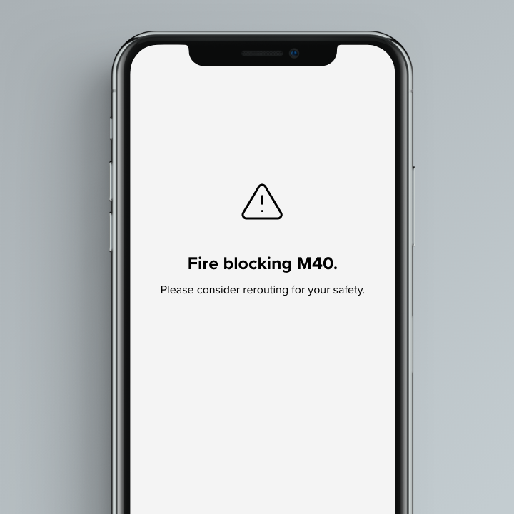
Day 6
Scenario: It's Monday. A user has just gotten into their car to drive to work. They plug their phone into the car and start driving.
Challenge: How would you let the user know there's a fire happening in a nearby town that is causing road closures? The effect on their commute is unknown, but there is a definite danger if the fire gets closer. How do you communicate this to them? When? Write it.
Character limits:
30 (Headline)
45 (Body)
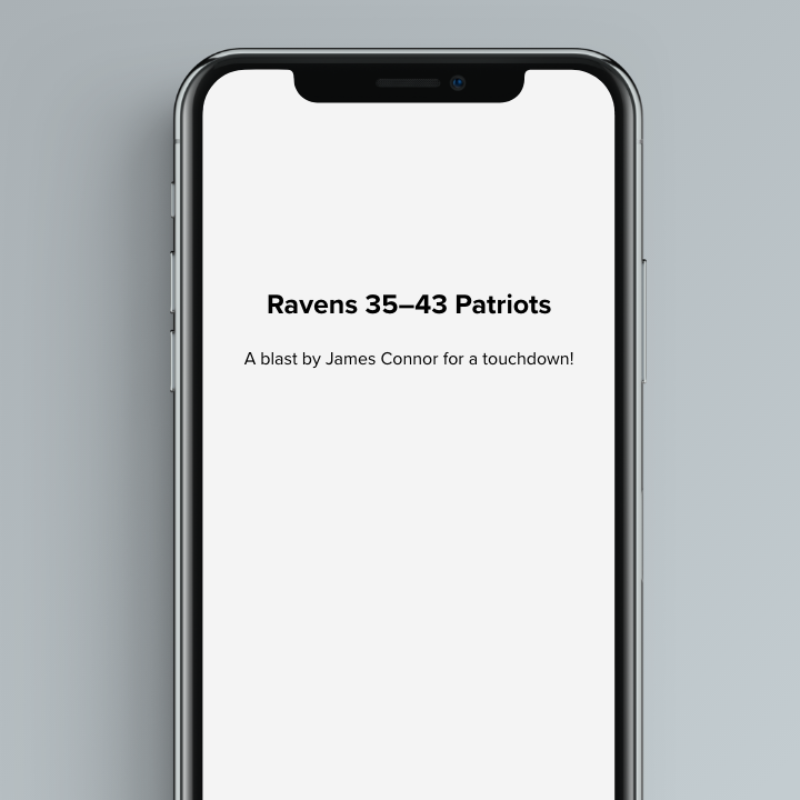
Day 7
Scenario: A sports fan is at a wedding while his team is playing their arch-rivals. His team makes a touchdown.
Challenge: How would you, quickly, let the sports fan know about the latest play, the current score, and the key players? Write it.
Character limits:
30 (Headline)
45 (Body)
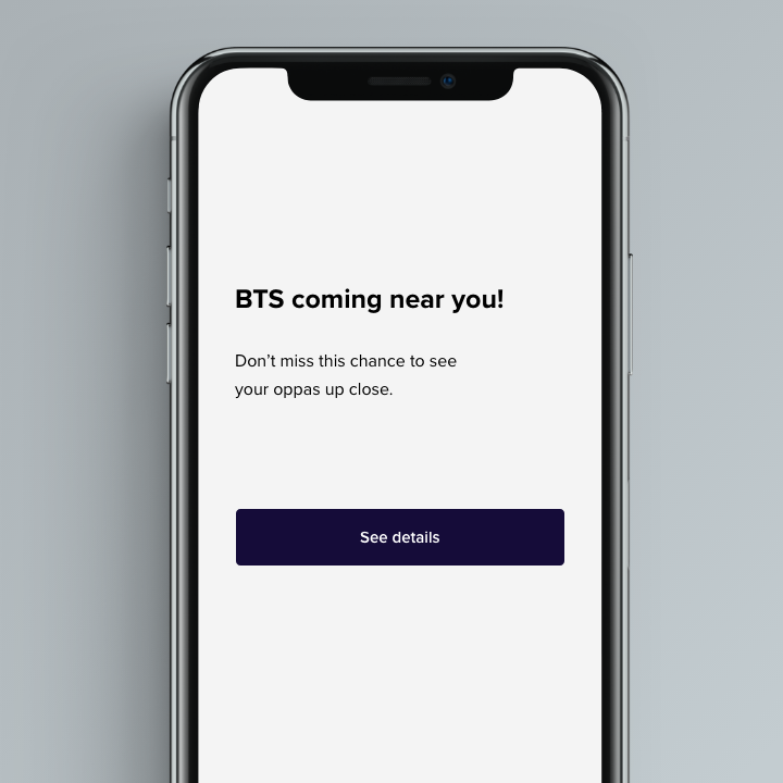
Day 8
Scenario: The user is a casual music fan and (on occasion) goes to live concerts. They have a music player app on their phone.
Challenge: Tell the user that one of their favourite bands is playing live in their town. How would you compel them to want to go?
Character limits:
30 (Headline)
45 (Body)
25 (Buttons)
Day 9
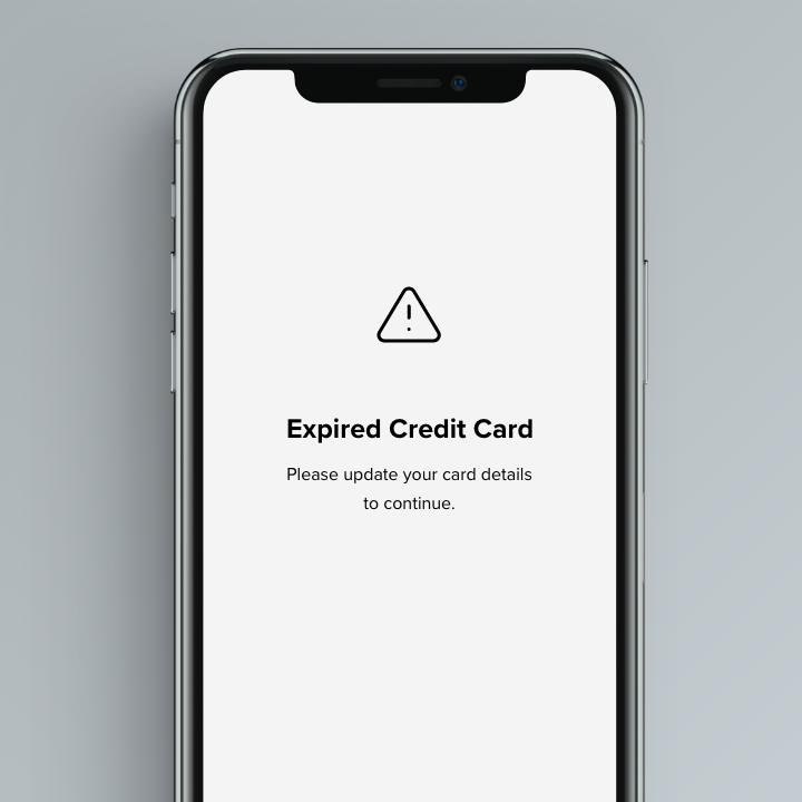
Scenario: The user is trying to rent a car using an application but the credit card they have on file has expired.
Challenge: Write them an error message so that they can correct the problem, and try not to be a jerk about it.
Character limits:
30 (Headline)
45 (Body)
Day 10
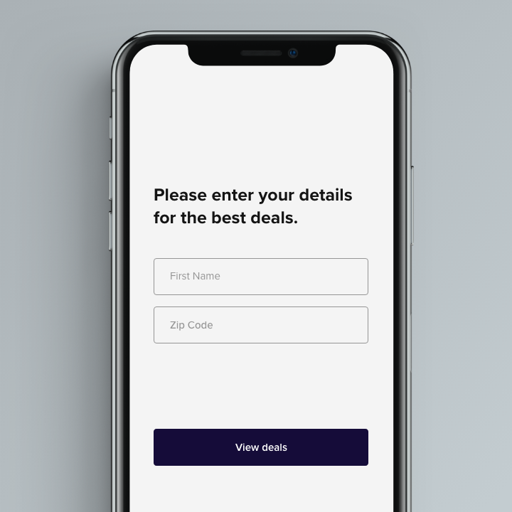
Scenario: The user is trying to view a website to help them buy a car. But, the content can't load without the user's location. They need to enter their ZIP code and first name.
Challenge: Ask them where they live and who they are without sounding like you're unnecessarily mining their data.
Character limits:
140 (Body)
20 (Buttons)
Day 11
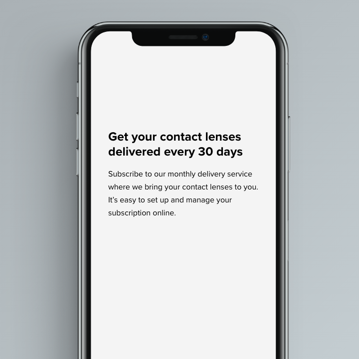
Scenario: An elderly user is doing a Google search to find an easy way to buy contact lenses online.
Challenge: Write a title and meta description for a website that sells subscription contact lenses delivered to a user every 30 days - convince them to try it.
Character limits:
60 (Title)
160 (Meta description)
Day 12
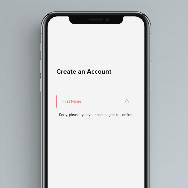
Scenario: A user is creating an account. When they come to the step where they are asked to enter their name, they get an error message. A fraud detection software thinks their name is fake - but it's wrong 5% of the time.
Challenge: Write an error message that prompts them to fix the error without shaming them for having a fake-sounding name.
Character limits:
45 (Title)
Day 13
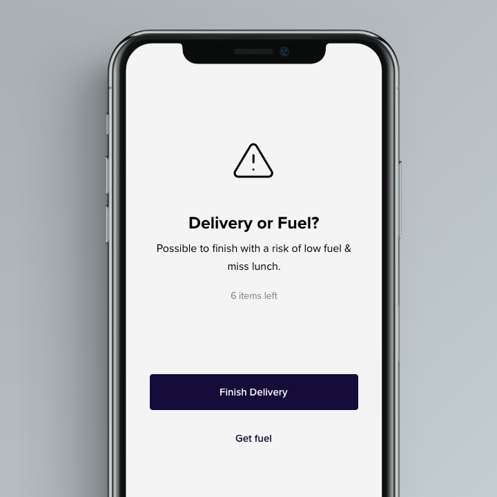
Scenario: A short-haul truck driver has a phone app that monitors his route, schedule, fuel & deliveries. He has 6 more deliveries before stopping for fuel and lunch. Due to unexpected traffic, he's behind schedule. He can choose to stay on his planned route for a few more stops, but risk running low on fuel and missing lunch, or he can get fuel and lunch now and finish the deliveries later.
Challenge: Write a push notification alerting him of this dilemma and options.
Character limits:
30 (Title)
45 (Body)
25 (Buttons)
Day 14
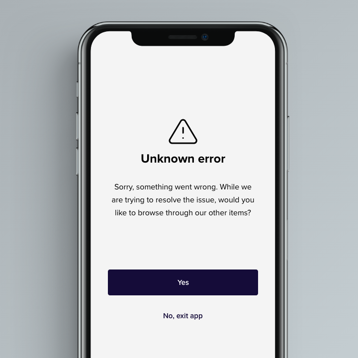
Scenario: A user is shopping using a price comparison app that boasts "REAL-TIME" pricing on items. As they are checking the price of an item, something goes wrong. The problem is unknown.
Challenge: Write a message that informs the user that they cannot access the app right now. You cannot specify "why" the app doesn't work, you also want them to continue using the app.
Character limits:
30 (Headline)
120 (Body)
15 (Buttons)
Day 15
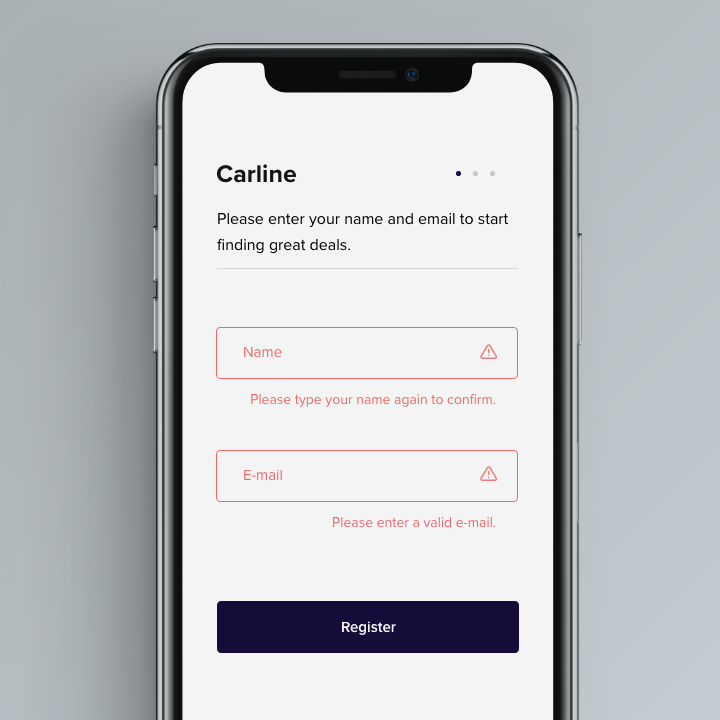
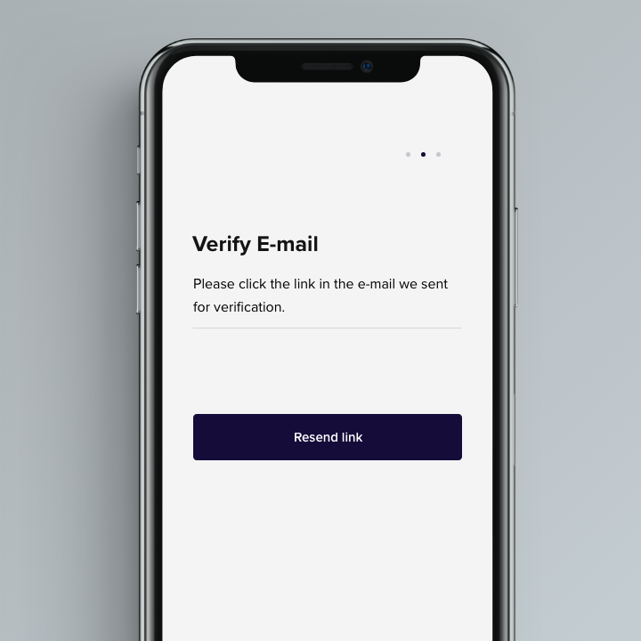
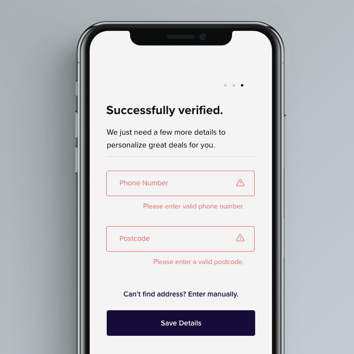
Challenge: Write a registration experience for a product for people who are shopping for cars online. The service helps registered users find the lowest price by contacting and comparing prices from three competing local dealerships. You can write as many screens as you feel is necessary to provide a compelling experience, but you must collect (in any order) all of the following information from users:
- Home address or valid mailing address
- Phone number
- Valid email address (incl. a verification step)
- Full name
Be sure to include unique error messages for incorrect entries for each screen.
Once you are done with your chosen challenge, include a short, one-paragraph explanation of your design decisions. Defend and rationalize your work.
Character limits:
30 (Headline)
120 (Body)
15 (Buttons)
Rationale: I split the registration process into three steps (screen) to allow the user to focus on a few things at a time. The first step was to receive their name and email which I believe is the bare minimum to get started. Similarly, I did not think phone number or home address was crucial at this point. The second screen simply asks the user to verify their email and allows them to resend the email if they didn't receive it. Finally, the third screen asks for the final pieces of information.
Throughout the screens, I tried to emphasize why they needed to give those details. As for the error messages, most of them are quite general except for Screen 1: Name. I simply asked them to re-enter their name in case the system picks it up as invalid and says its wrong instantly. So, maybe it is possible to double check from the user end to verify it is the correct one.
Other projects
Also check out some of my other work.