March 2019 - Present
Portfolio Design
An ongoing story of this iterative portfolio and my design journey.
Roles: Designer & Developer
Tools: Adobe XD, HTML/ CSS, Google Analytics, PageSpeed Insights, WAVE
2021 © Designed & coded by Nischal.
An ongoing story of this iterative portfolio and my design journey.
Roles: Designer & Developer
Tools: Adobe XD, HTML/ CSS, Google Analytics, PageSpeed Insights, WAVE
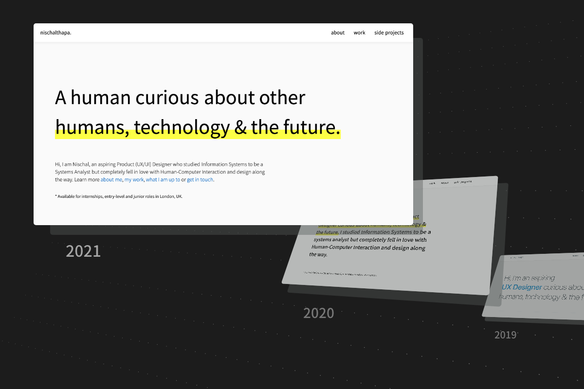
The first iteration | Building a foundation | 2019
The second iteration | A more systematic approach | 2020
Third time's the charm? | 2021
Reflections
What's next?
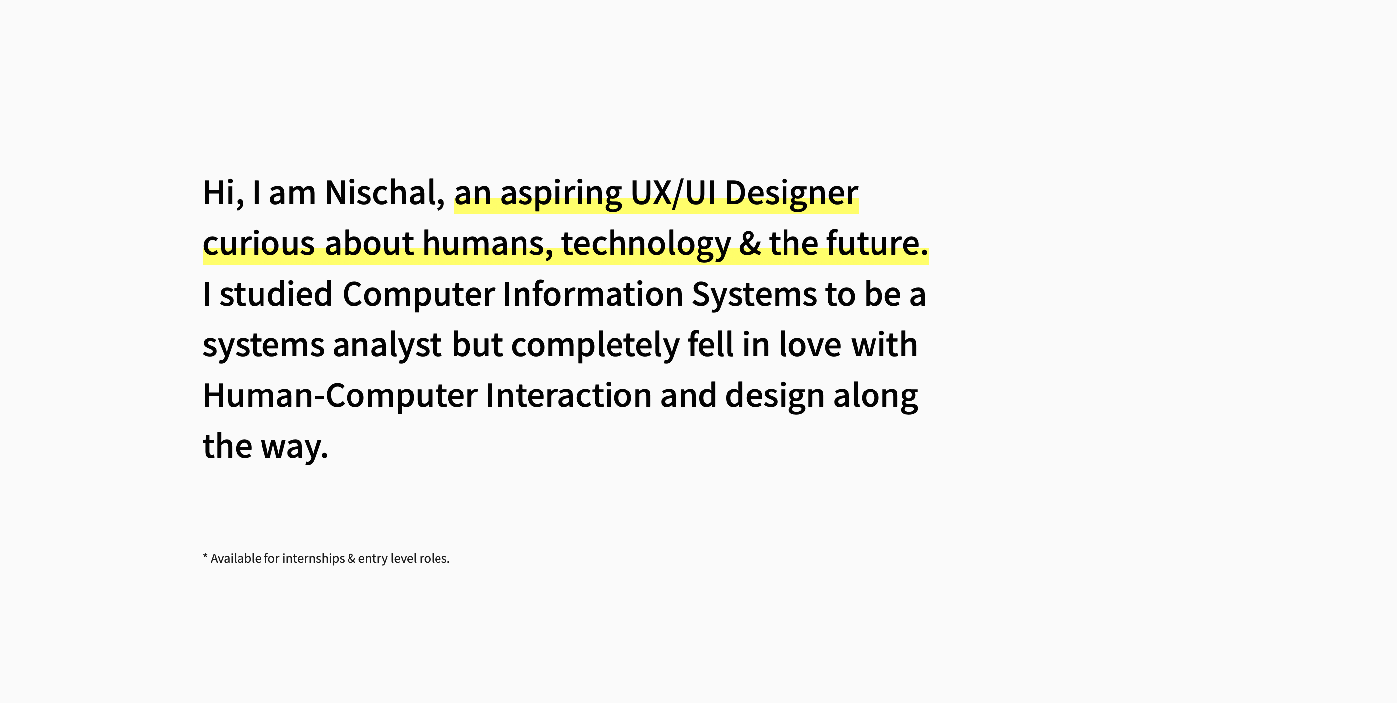
The conception of my first portfolio started once I knew that it was a requirement for job applications. At that time, I did not have many projects and knew very little about design itself. However, to not miss out on some of the available opportunities, I decided to put together a portfolio.
Like any design projects, it was important to understand the problem space. Hence, through secondary research via blogs and other portfolios, there were some key takeaways in what goes in a portfolio:
UX portfolios focus on the process
UX portfolios provide a way for recruiters to see the designer's thinking and working style.
Recruiters don't read everything
After reviewing several online design communities, there was a common pattern amongst recruiters of skimming the portfolio.
Show enthusiasm
Specifically for entry-level positions, most job descriptions highlighted enthusiasm and passion for the role.
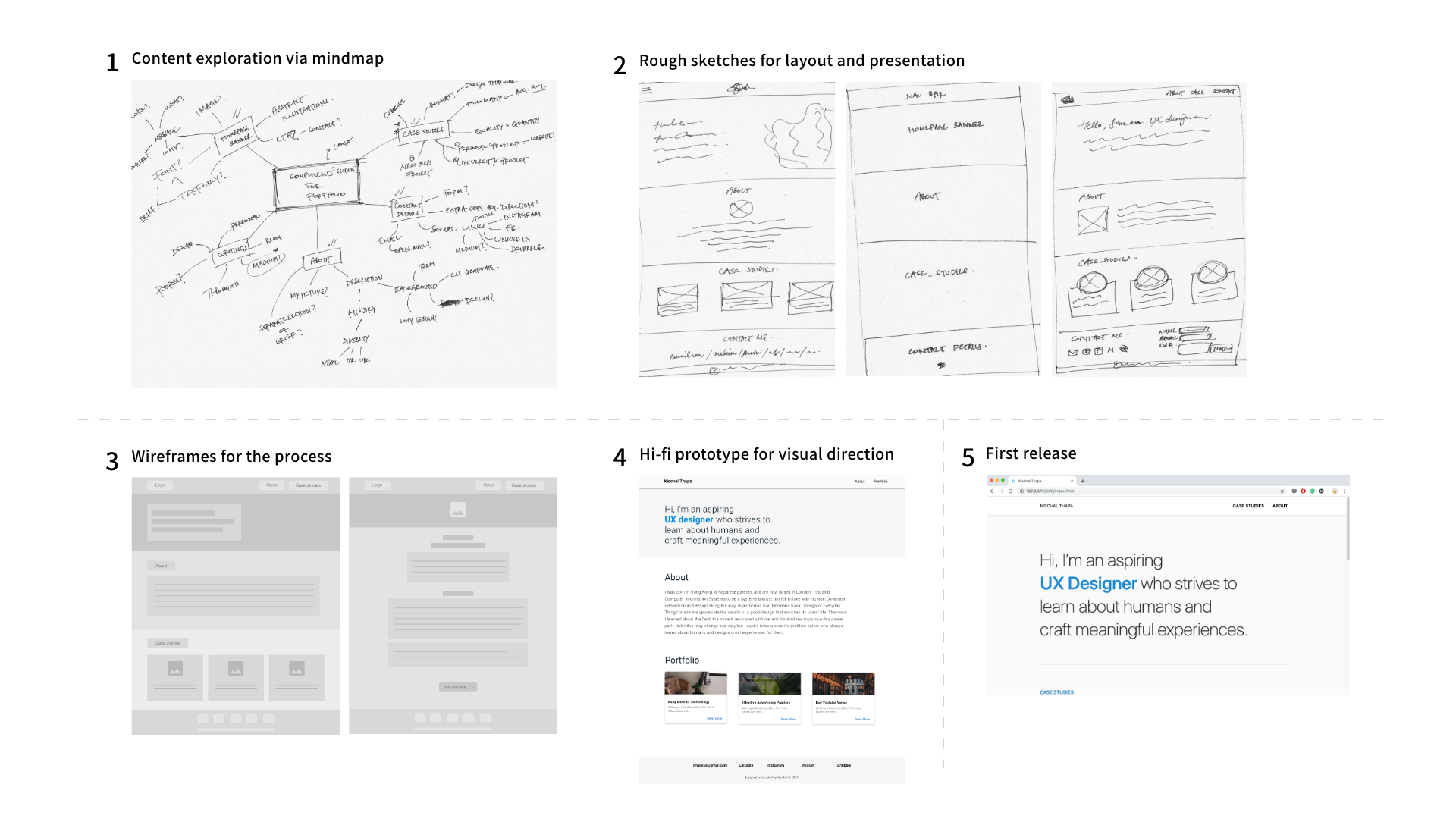
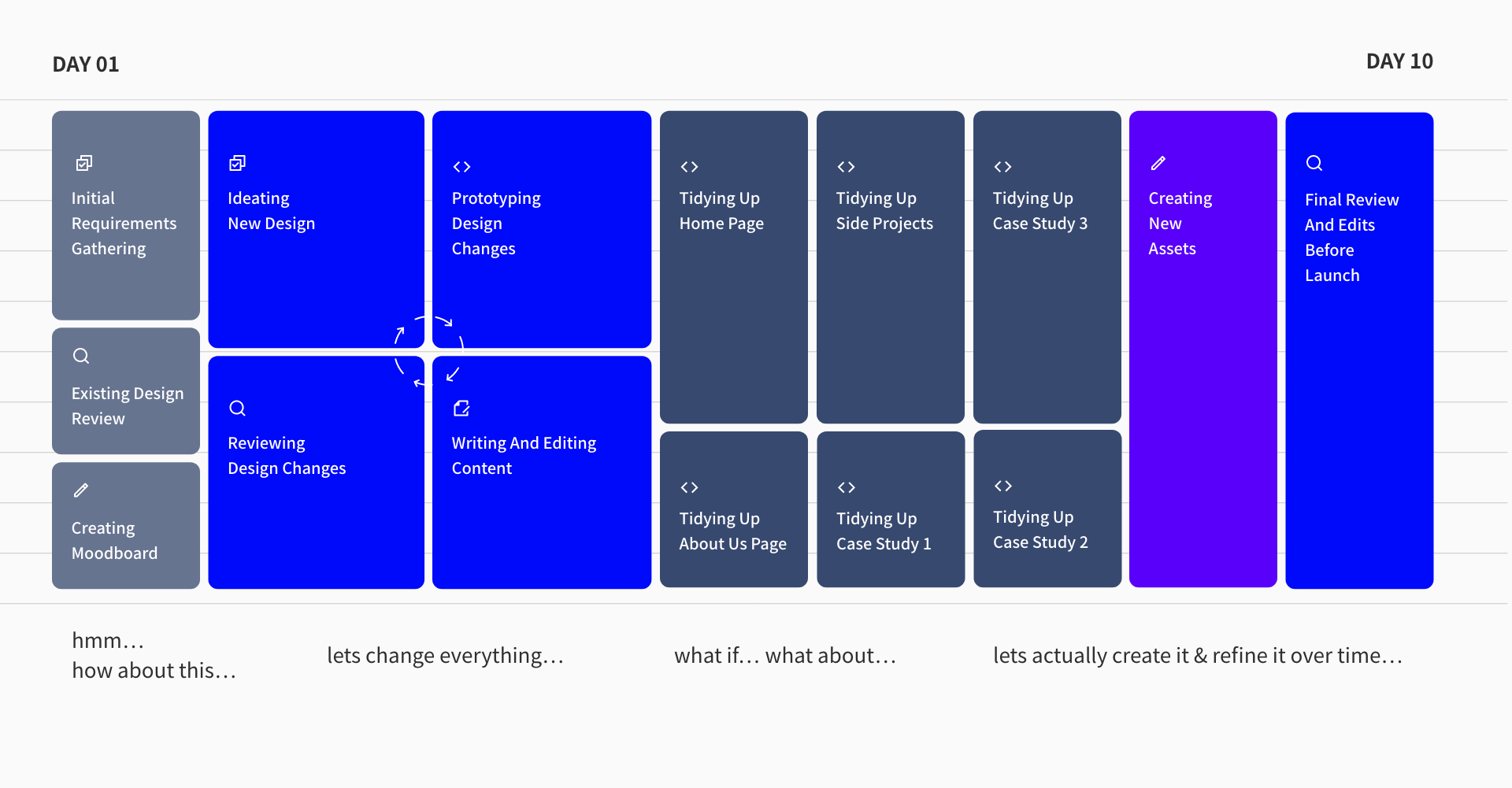
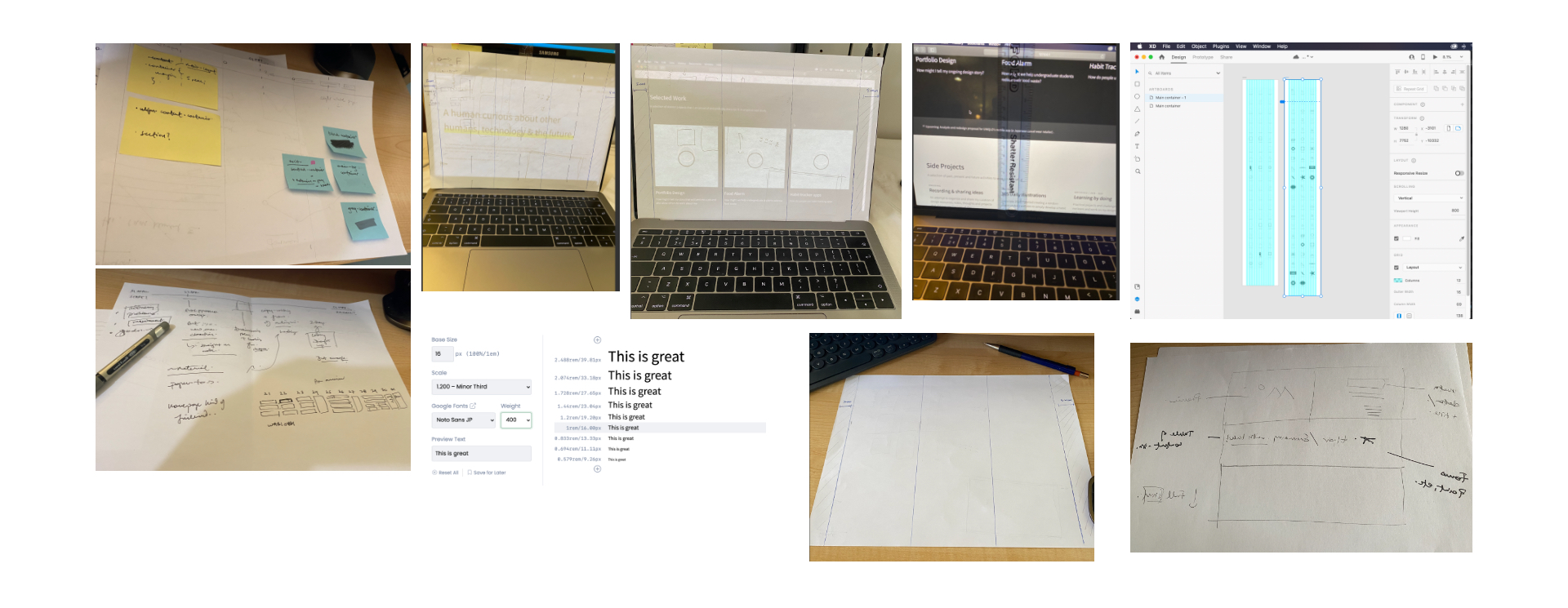
Using the findings, a few rough sketches and ideas were drafted with an emphasis on content over creativity and visual aesthetics.
Preparing the case studies and coding the website
In addition to following the typical design process and activities, the majority of my effort was spent on editing the case study, side projects and implementing the design in code.
With further refinements on feedback, I was able to secure a few interviews with positive prospects. However, due to an injury, I had to stop my job hunt for a while.
In retrospect, the whole process would have been quicker if I used a website creation tool like Wix or Squarespace, but in the long run, I would benefit a lot more from coding the website in terms of cost and personal development.
My biggest takeaway from the first release would be to aim for less perfection and more iteration throughout the process.
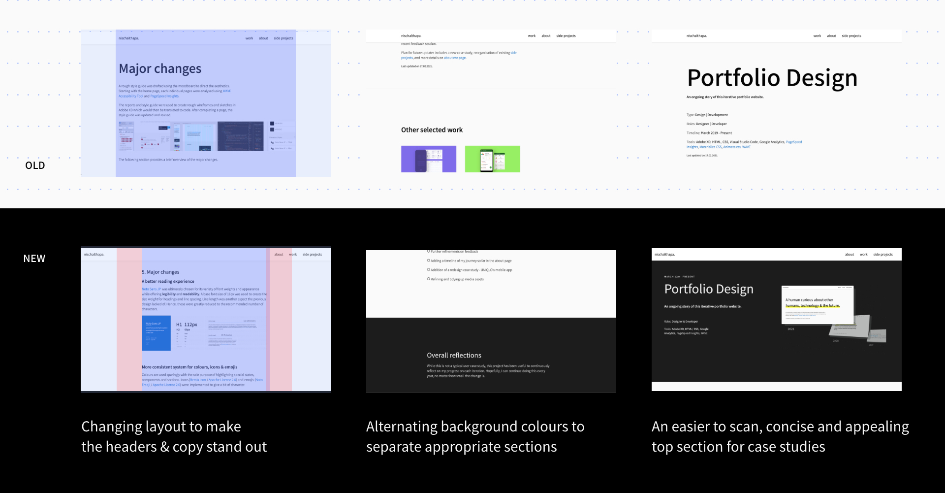
The need for a major redesign emerged in mid-2020 while I was reviewing my old portfolio and it did not reflect my skills and abilities at that time. I was disappointed at how cluttered and unappealing it was, especially the lack of negative space and presentation of case studies. So I decided to redesign the whole website, and this time, using a more systematic approach.
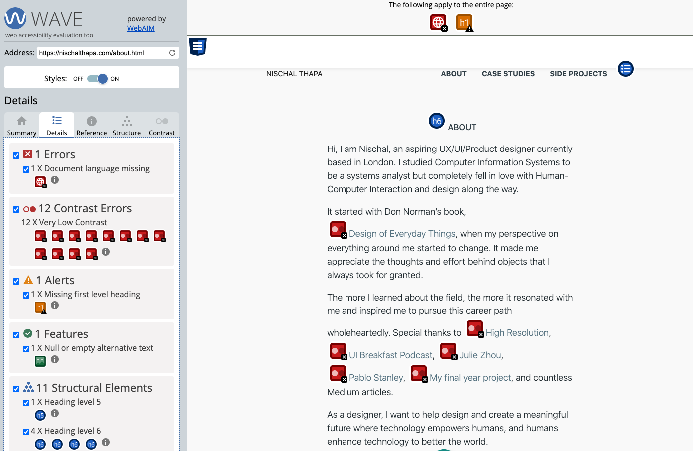
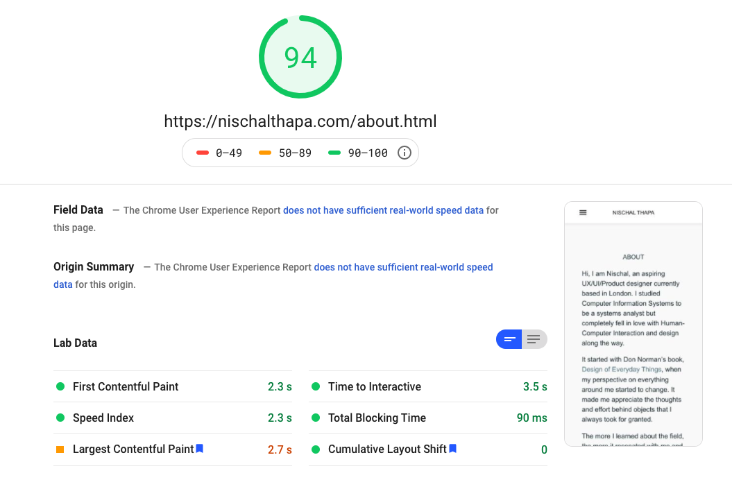
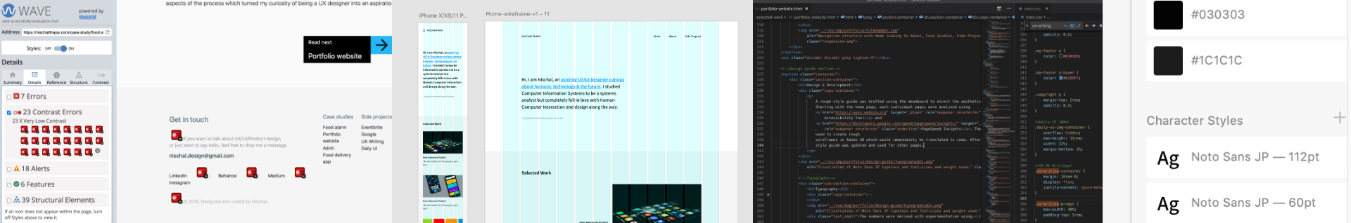
In addition to aesthetics, there were other aspects to refine such as accessibility and performance. Tools including WAVE Accessibility Tool, PageSpeed Insights & Google Analytics implied:
Accessibility, mainly contrast and structure of the pages were poor
Image quality and sizes needed to scale to improve performance
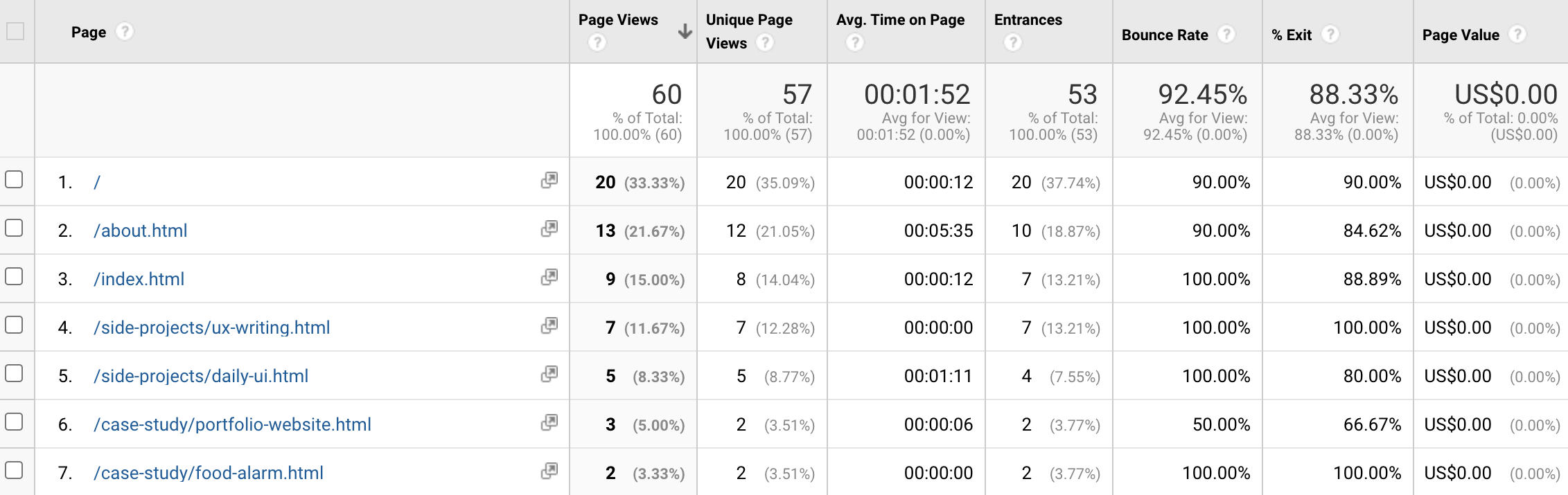
Reiterated the need to change, especially due to poor performance of the case studies pages & drop-off rates at the homepage
Refine visual aesthetics
Update past content
Add new content
Improve accessibility
Improve site performance, especially case studies
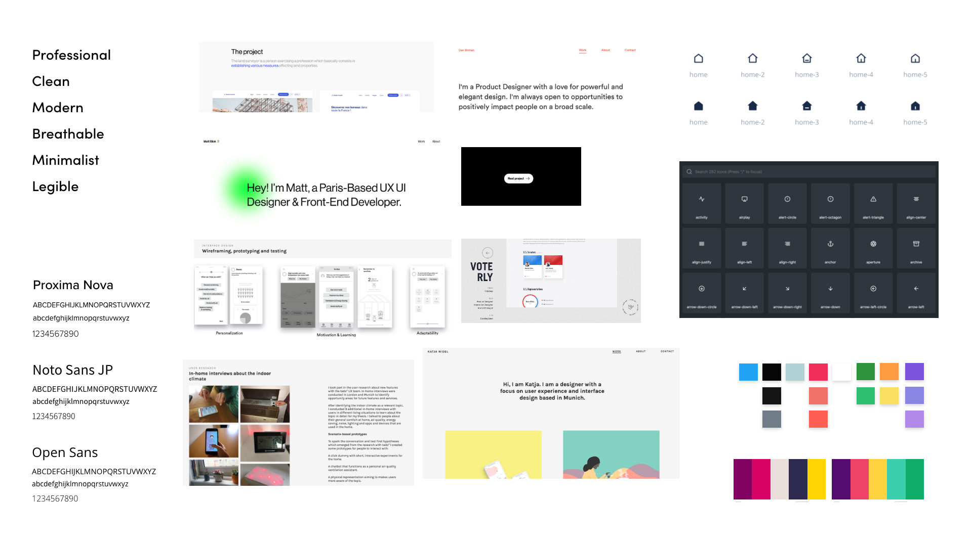
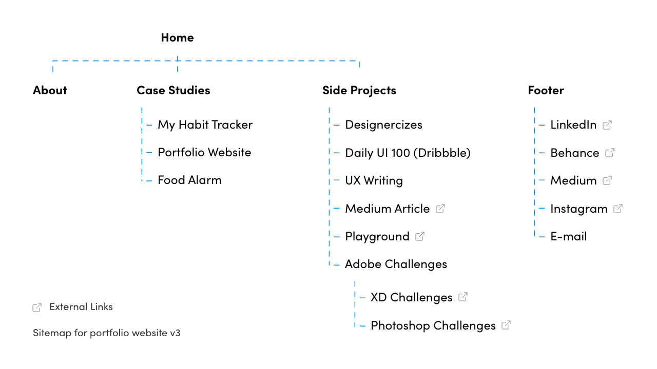
I curated a moodboard to have a rough sketch of the visual design direction. The main emphasis was on simplicity, which would eliminate distraction and also reflect my personal taste for aesthetics. A sitemap was also drafted to organize all the pages, links and create a guide for the structure of the homepage.
Using the moodboard and reports of individual pages from WAVE Accessibility Tool and PageSpeed Insights, I created rough wireframes of the new design in Adobe XD first. Then, I implemented it in code one page at a time.
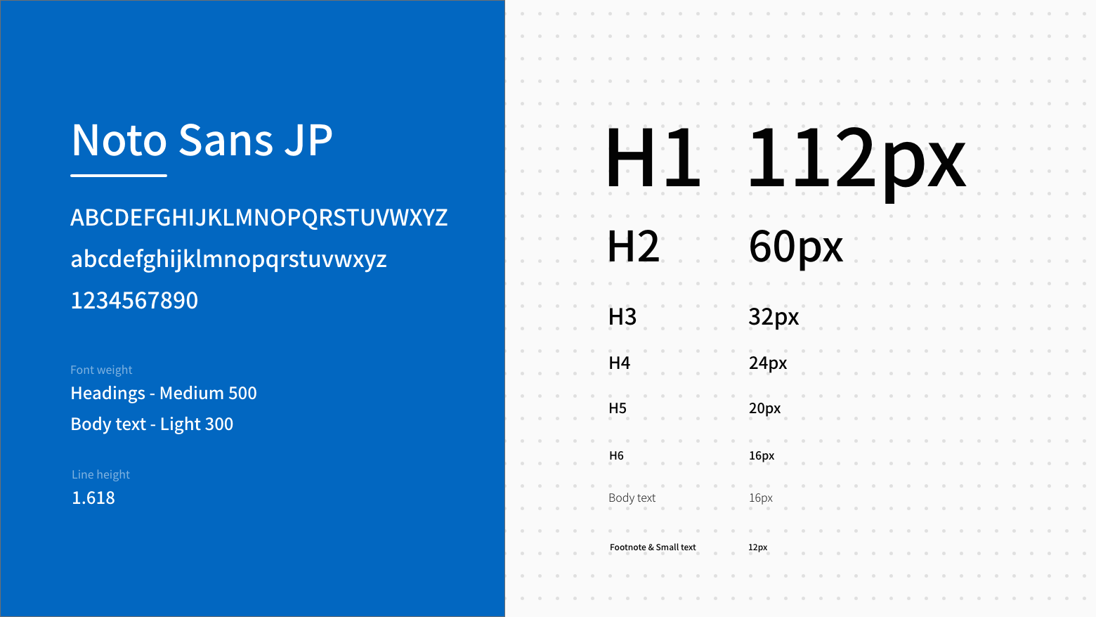
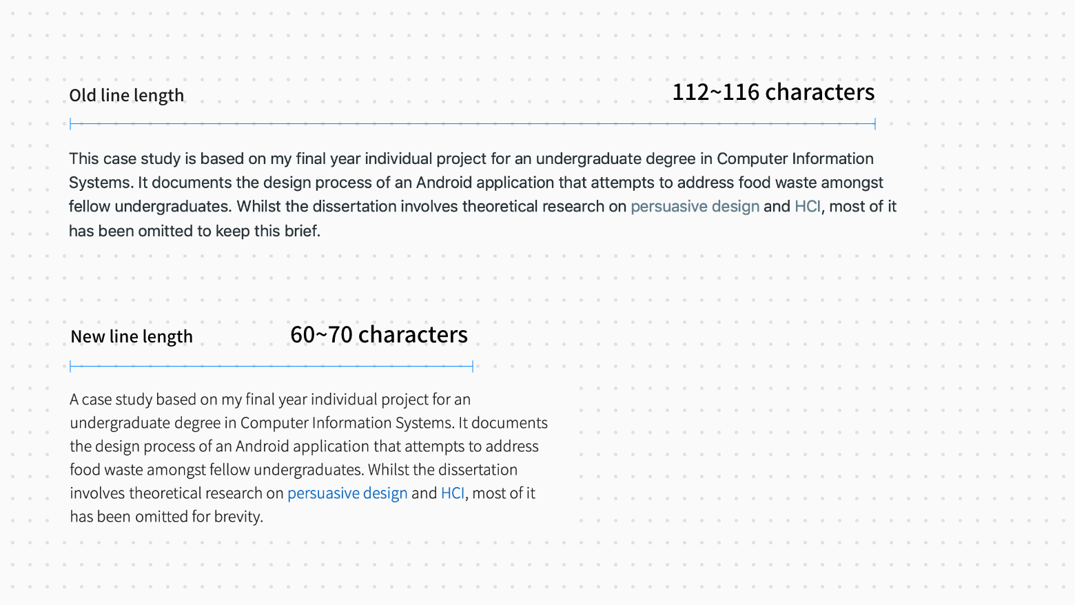
Noto Sans JP was ultimately chosen for its variety of font weights and appearance while offering legibility and readability. A base font size of 16px was used to create the size weight for headings and line spacing. Line length was another aspect the previous design lacked of. Hence, these were greatly reduced to the recommended number of characters.
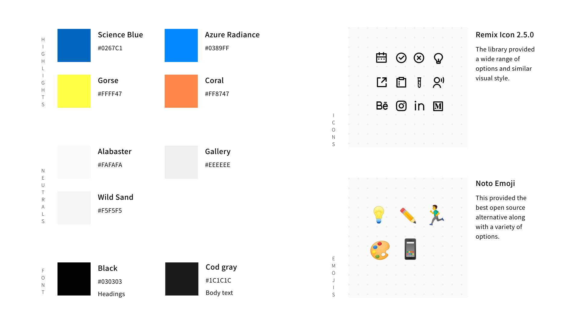
Colours are used sparingly with the sole purpose of highlighting special states, components and sections. Icons (Remix Icon / Apache License 2.0) and emojis (Noto Emoji / Apache License 2.0) were implemented to give a bit of character.
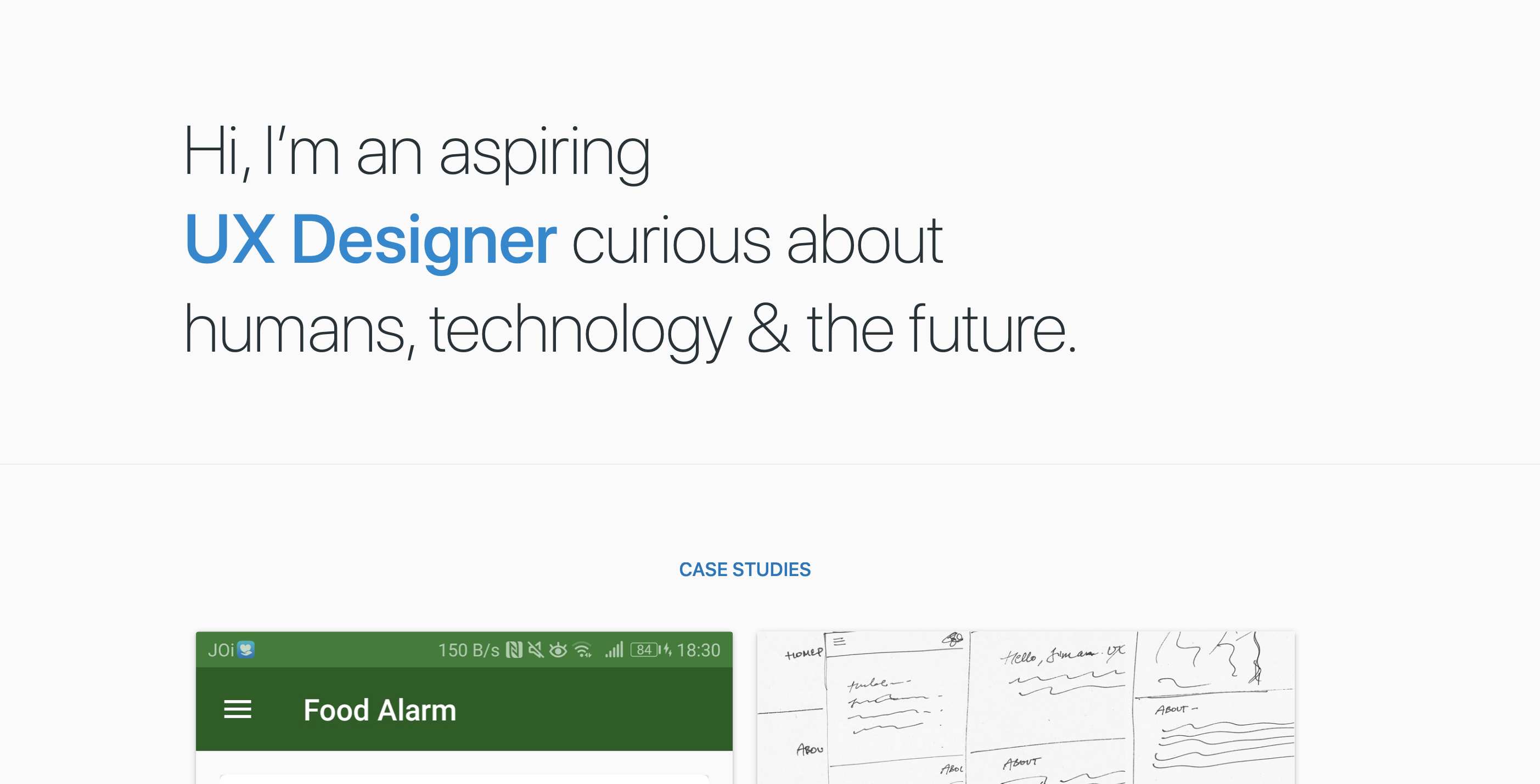
A short self-introduction and my current status are relatively more useful & informative than the previous iteration.
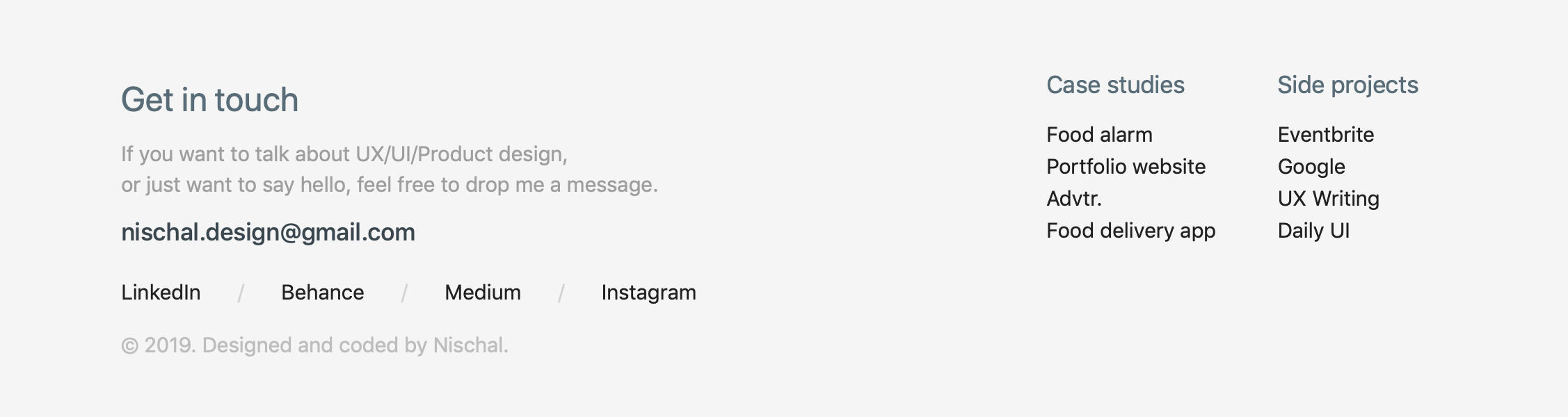
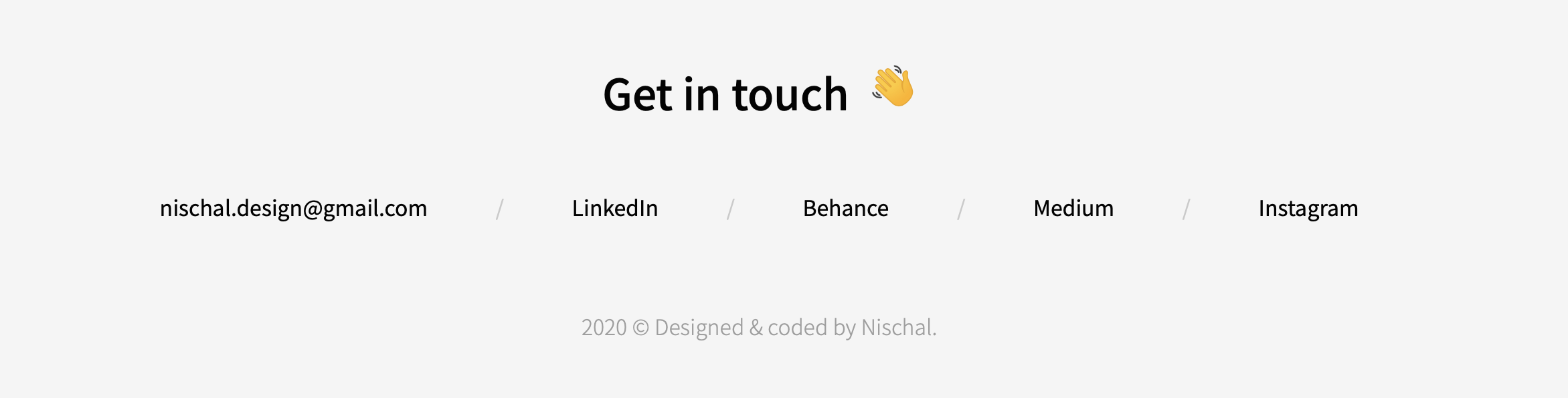
With increasing numbers of pages, the footer was bound to be more complicated. Hence, I repurposed the footer for contact purposes only which is more suitable in the case of a portfolio.
To gather opinions on the redesign, I did a quick informal feedback session, where I showed both of my designs and asked them for their opinions.
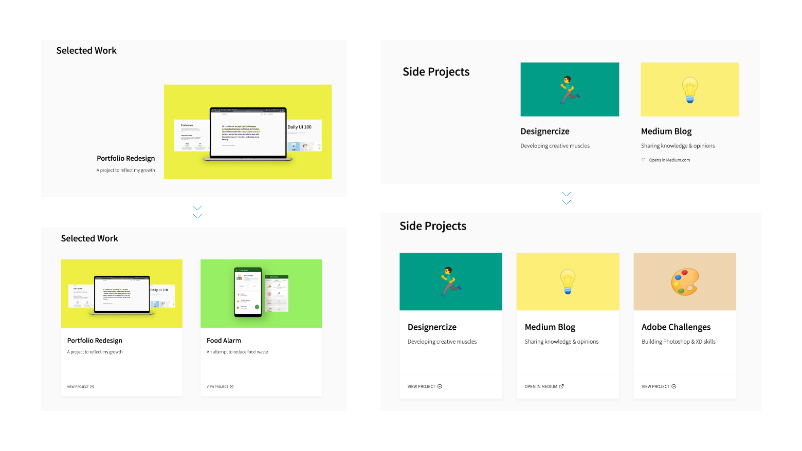
The general consensus showed to prefer the card design and project layout on the homepage of the previous version, and the navigation and hero section of the new design.
Overall, most goals and objectives were accomplished for the redesign.
Refined visual aesthetics with a cleaner interface
Updated past content with a focus on presentation and layout
Introduced new case studies and side projects
Reduced the total amount of accessibility errors from 197 to 0
Improve site performance, especially case studies. This is a bit ambiguous since landing a job involves more than just the portfolio. However, I have classified it as a failure since there weren’t any significant improvements in terms of visitor and bounce rates.
The second iteration has been extremely helpful in many ways. Not only has it improved my design skills and process, but it has also allowed me to reflect on my progress since I first started. Throughout the redesign, I was able to constantly be more intentional about my design choices, which was almost non-existent in the first iteration.
While the previous iteration focused mostly on visual aesthetics, this iteration focuses more on the flow and content. This was primarily due to common feedback from hiring managers stating that the case studies were a bit hard to follow along.
In addition to making the reading experience better, I also realized that the contents were a bit outdated and needed to reorganize.
The whole process was a mixture of brainstorming ideas on paper, implementing in code, then refining. The following are some of the major changes to improve the reading experience.
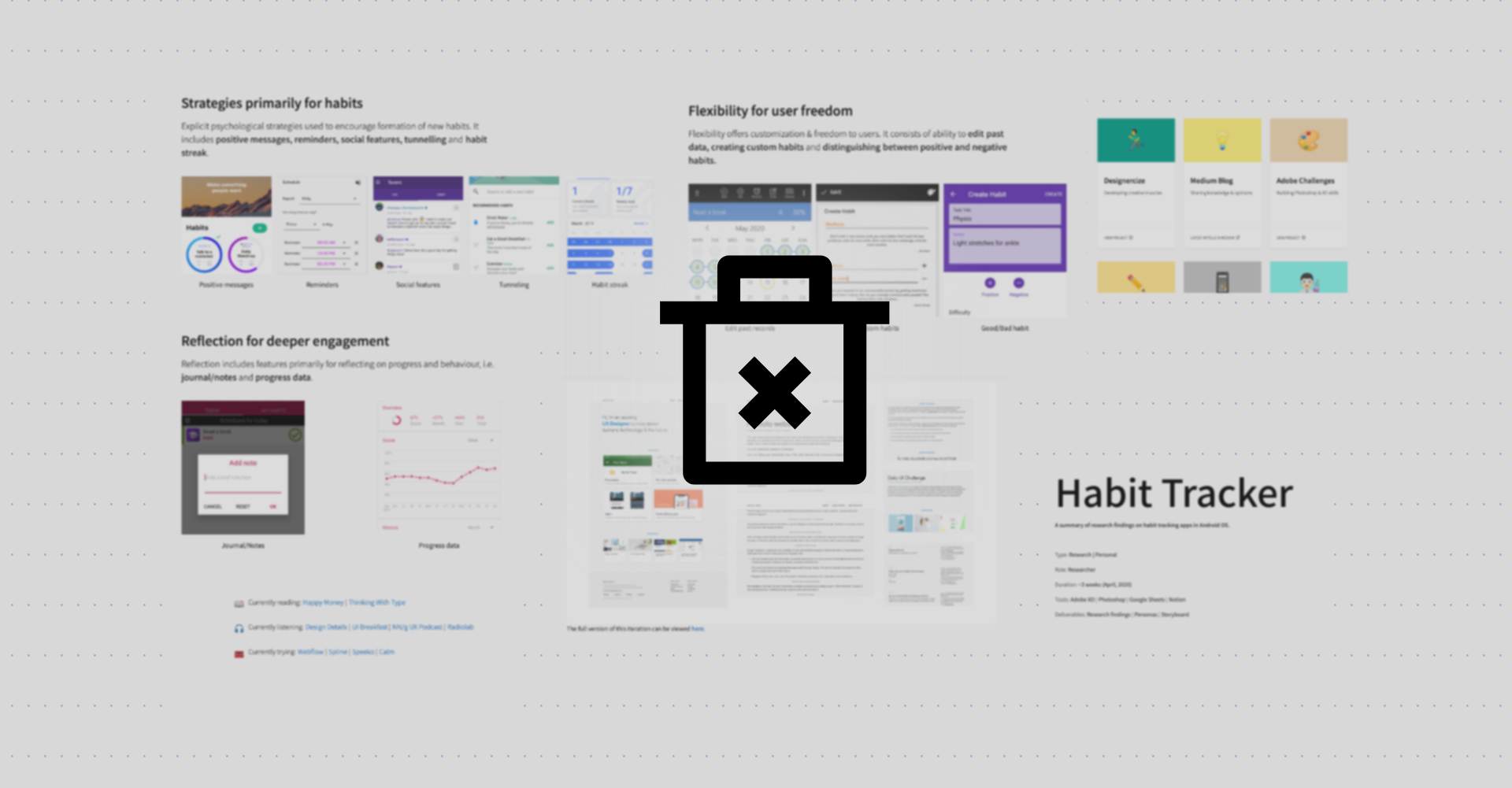
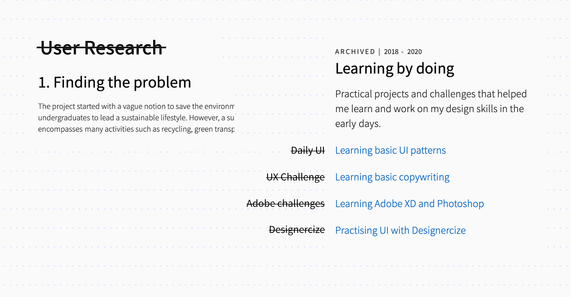
It was unfortunate but some of the content in case studies only made it more complex and had to be removed altogether.
It seemed more informative and gave a better sense of understanding to readers, especially those who skim.
I decreased the header sizes, shifted the content to the centre, added subtle changes in the background colour to separate sections and highlight important sections, etc. with the intentions of a better reading experience.
While there were countless tradeoffs and decisions to be made throughout the project, there was one thing that made me think a lot.
Due to my background as a Computer Information Systems graduate, it was inevitable that most of my projects have something development related, including this portfolio. However, that raised confusion as to whether I am a front-end developer or a designer.
At this point, I view coding as another prototyping tool. I do not write production-ready code or complex algorithms for optimisation. I simply use it as another tool in the process to create a better user experience.
In the end, I decided to keep it since it’s a part of my unique selling point. However, I reduced and rephrased the instances where I do talk about it.
While I wait for the results, a few notes to my future self after the third iteration.
It is important to think a lot but there is a time and place for everything, and sometimes you just have to start making decisions and sticking to them.
Rather than working to perfect that one solution, go for a good enough solution then test it out and iterate... iterate... iterate...
Each project is unique and does not require a persona, a storyboard or a wall full of sticky notes. Use what seems best for purpose based on context and experience.
Further refinements on feedback
Addition of a blog and resources page
While this is not a typical user case study, this project has been useful to reflect on my progress on each major iteration, and perhaps, helped me along my journey to define what design means to me. Although progress has been slow due to personal injury and COVID-19, I hope to continue learning and growing until & after I can officially call myself a Product(UX/UI) designer.
Also check out some of my other work.